

Why do some pages just look better than others Often, the smallest efforts can be the difference.
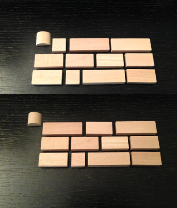
Alignment is an important concept in typography. When something is misaligned, it causes an interruption, which can detract from communicating the message as clearly as possible. To avoid this situation there is an easy trick we have in typography called "hanging" punctuation. By placing the opening quotation mark in a paragraph slightly to the left of the straight edge you present a strong, straight line of type for the reader. Your eye can then more easily focus on the content itself. Certain software, like Adobe InDesign, will do this automatically for you. Otherwise, you have to do it manually. But it's always a good idea, so the message you are communicating is clear and uninterrupted. Look closely at the images to the left to see the difference. Notice how the line is uninterrupted in the image on the bottom.