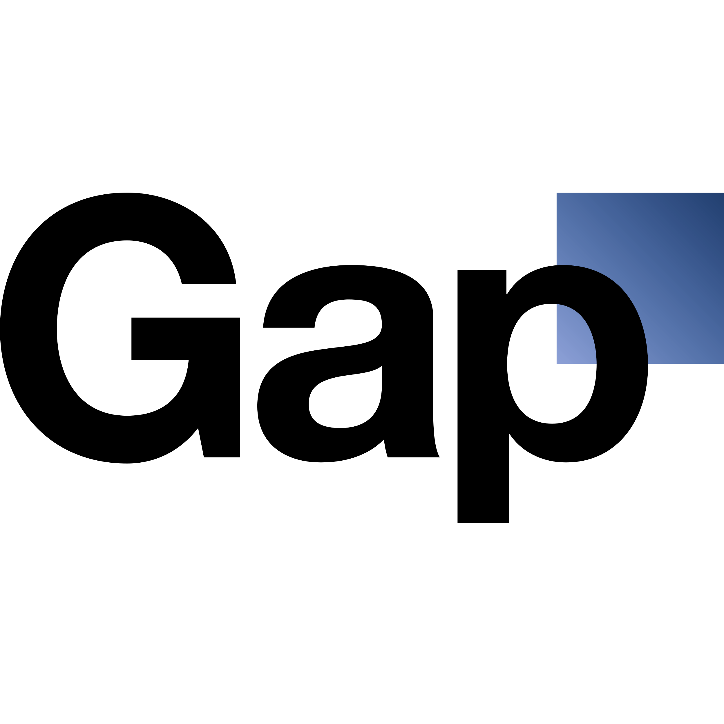
Logo Credit: The Gap Inc, Trey Laird
In 2010, the Gap clothing company launched a new logo that customers hated so much the company ditched it in less than a week. So, what exactly happened? The Gap logo redesign was a simple change – departing from the known brand to one with lowercase letters and a blue box on the side. Customers, immediately flooded social media channels with thoughts that the new image looked cheap and tacky.
Why the Gap Logo Redesign Went Wrong
While there was nothing glaringly wrong about the new logo, the change came when customers didn't want a change. Companies typically update a brand when they feel the old one is outdated or doesn't represent the current business. In most cases, a new logo can revitalize a brand and bring further attention. In Gap's case, the logo was a step backward.
The Gap logo redesign teaches us two things:
The timing of a redesign must be correct and not become a change for the sake of change. Tie your new brand directly to shifts or changes in your company.
Seek input from customers beforehand. The Gap failed to test customers before launching the new logo. The backlash was a surprise and put the company on the defensive. It is imperative to get a reaction from established customers.
The company reverted to their previous design within just a few day, but there is no telling how much time and money was wasted. A new logo offers a world of opportunity, but only if done in a way that moves the company forward.
Clear, Crisp Creations from m design
m design utilizes smart, sophisticated graphic design to elevate your business. To learn more about our broad range of design services, visit our website or give us a call at (410) 728-5007.


