
Logo Credit: Jones Knowles Ritchie (JKR)
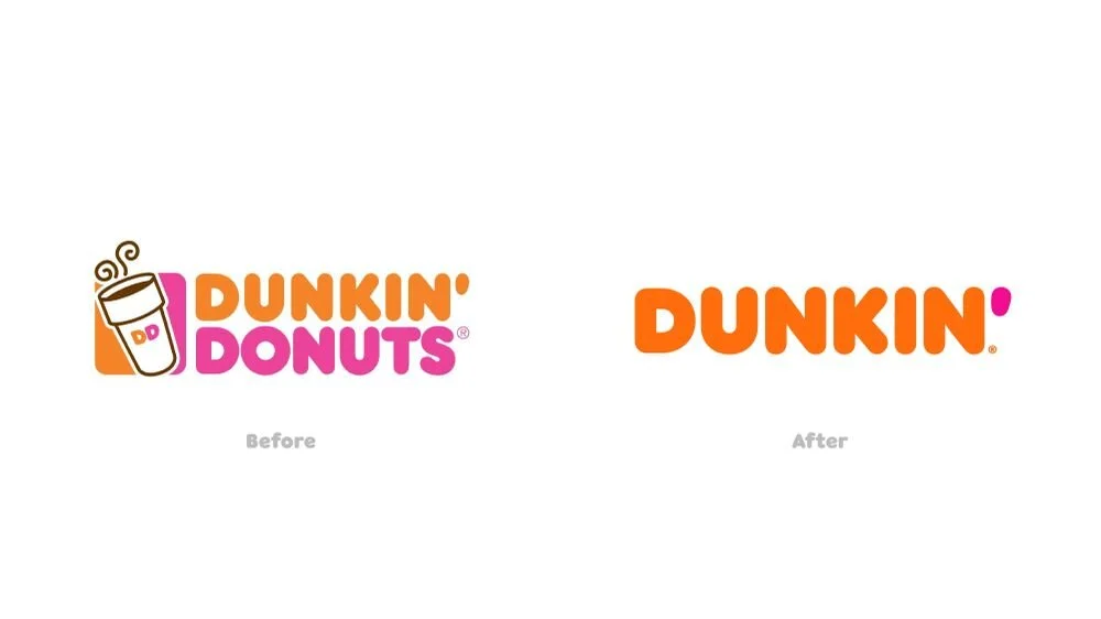
Over the years, Dunkin’ has become a household name. Just about everyone recognizes the slogan “American Runs on Dunkin’” introduced in 2006. Then, when the name was shortened from Dunkin’ Doughnuts to Dunkin’ in 2018, the change felt natural and business continued without interruption. What made this rebrand one of the most successful in recent years?
One thing to note about Dunkin’s rebrand is that their marketing foundation was already quite sound. Sometimes, companies will completely “revamp” and, by doing so, abandon already established brand recognition. This wasn’t the case with Dunkin’.
Dunkin’s image was conceived in 1973 when they introduced their playful block typeface and bright pink and orange color scheme. Since then, the combination has become iconic and universally recognized. By the time 2018 rolled around, customers were already referring to the brand as Dunkin’, even before they shortened their name as a result of the, “America Runs on Dunkin’” ad campaign. To add to the smoothness of the transition, the brand also stuck with the unusual color palette.
The end result? A shorter name, a simpler logo design, and a declaration that the business indeed offers more than just doughnuts. All of this from capitalizing on brand recognition that had been developing for almost 50 years!
Explore Rebranding with Graphic Design Solutions at m design
m design utilizes smart, sophisticated graphic design to elevate your business. To learn more about our broad range of design services, visit our website or give us a call at 410.728.5007