m design north + south

studios.jpg

m design opened in Baltimore in 2002. Today the firm has two locations we call home. 
This month, we are taking you behind the scenes to show you our studios and brag about
the creativity that echoes through these walls every day!


Hooper Mill:  m design north

Located in Baltimore’s historic Woodberry, this old factory site has been our home for many years. Built in the late nineteenth century, the facility was originally a cotton duck mill. Many
of the original architectural features of the structure still remain, including 25ft-high ceilings, large windows and working tilt-in transoms.

The building now houses restored offices and studios for artists, photographers, craftsmen
and small businesses. Ours is a breezy, light-filled space conducive to creativity. Because we believe in collaboration, m design is thrilled to be sharing this rustic, factory space with two writers, two experience designers and one dog––and we love visitors!


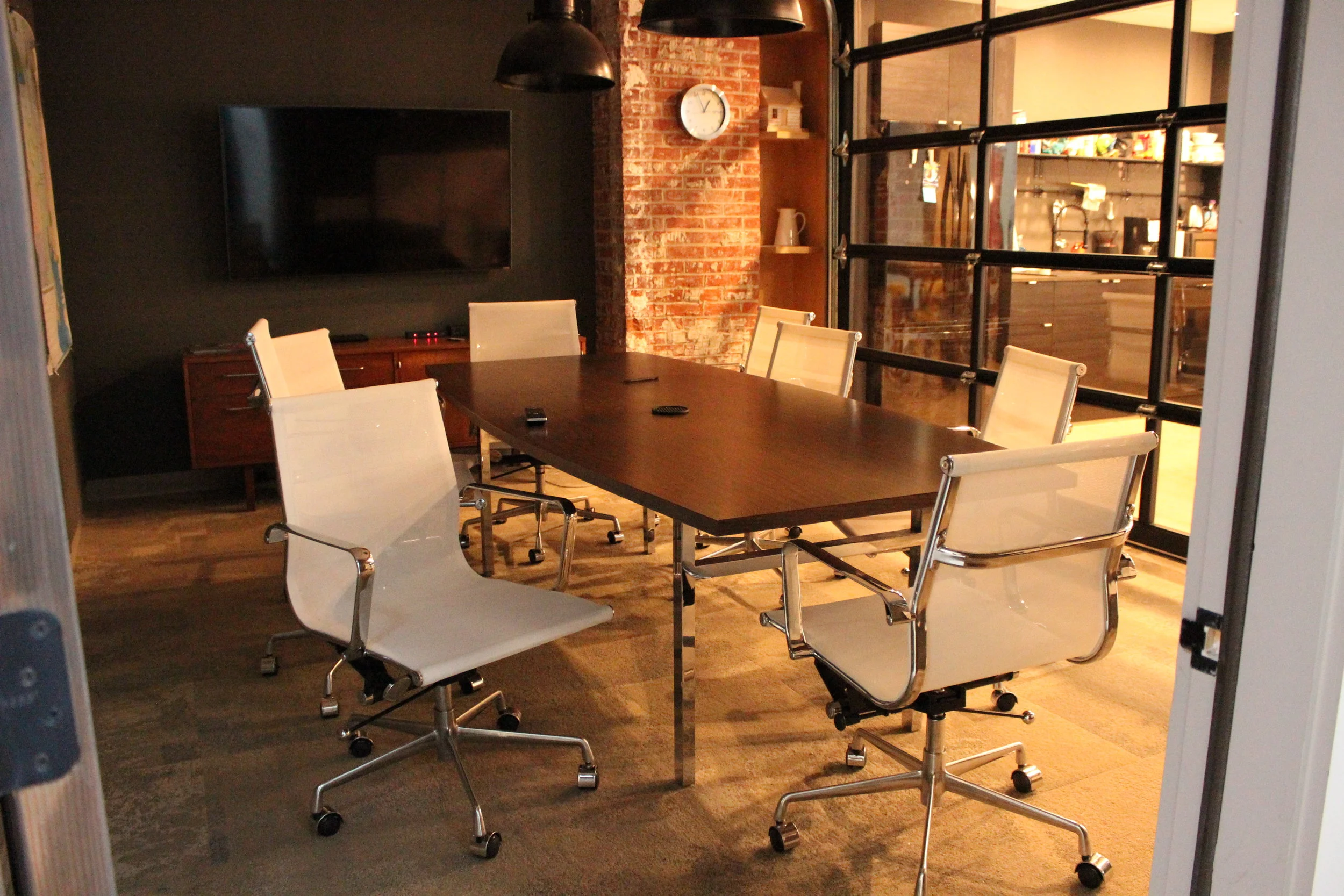
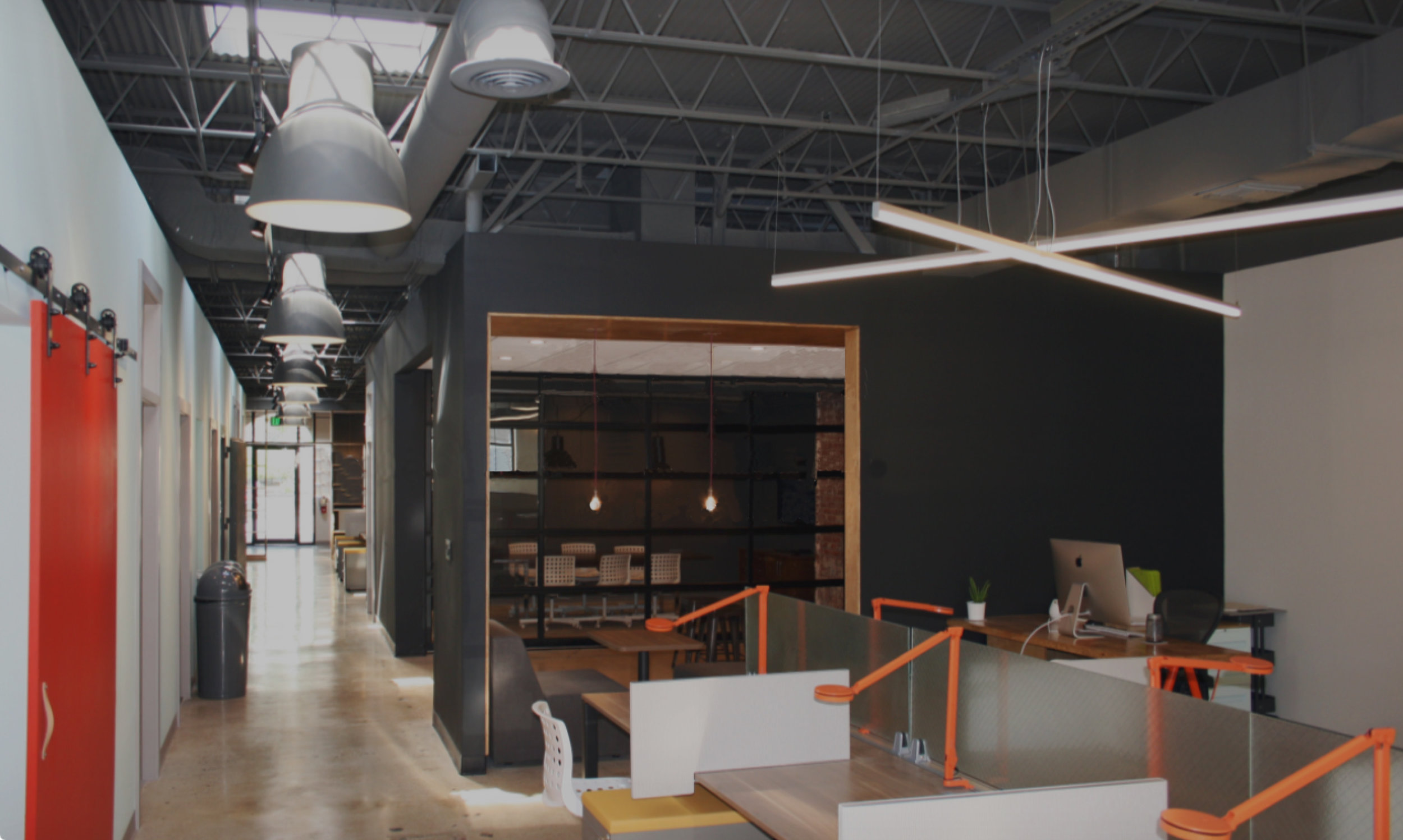
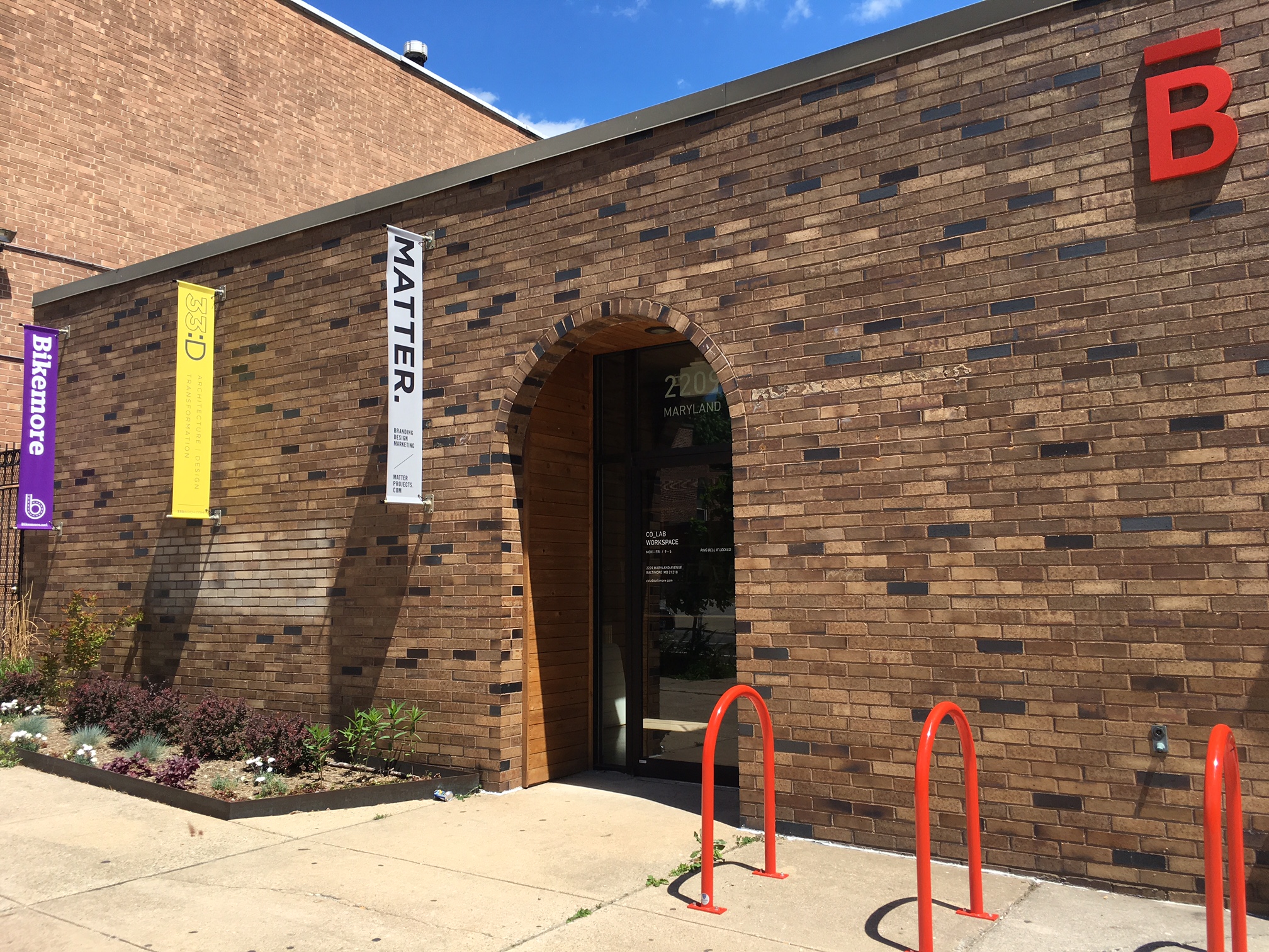
Co_Lab:  m design south

Bright, bold, industrial and architectural, this inspiring space is our new home several days a week. Co_Lab offers a variety of private areas to chat, read, sketch or meet with clients. There is a large, folding, glass garage door that divides the kitchen and conference room, allowing
for natural light and a wide open feeling. Surrounded by other like-minded individuals, the creativity and inventiveness seems to flow. This modern, downtown office is the latest place where we can be found generating smart design!


We hope you enjoyed our backstage tour! We look to sharing much more with you over the next few months, so stayed tuned, subscribe if you like and follow us on social media.


justified type

Sometimes the push of a button on the computer is not enough.

Rivers can be beautiful, but not in typography! Typographic "rivers" are visually distracting areas
of white space that look like rivers winding through the text. This problem occurs when working with justified type, where both sides are straight. In
word-processing programs, justification can be achieved by simply pushing a button, but the computer is not perfect. Often, there will be too many words on some lines and not enough on others—creating rivers! The solution is to go in and adjust manually. If there are too many words, move some down, or not enough words, move some back up. Compare the example to the left showing undesirable "rivers" with the image at the top revealing a nicely justified body of text. Then decide if you are willing to do the extra work to make your justified type look good!


hanging punctuation

hp.png

Why do some pages just look better than others Often, the smallest efforts can be the difference.

Alignment is an important concept in typography. When something is misaligned, it causes an interruption, which can detract from communicating the message as clearly as possible. To avoid this situation there is an easy trick we have in typography called "hanging" punctuation. By placing the opening quotation mark in a paragraph slightly to the left of the straight edge you present a strong, straight line of type for the reader. Your eye can then more easily focus on the content itself. Certain software, like Adobe InDesign, will do this automatically for you. Otherwise, you have to do it manually. But it's always a good idea, so the message you are communicating is clear and uninterrupted. Look closely at the images to the left to see the difference. Notice how the line is uninterrupted in the image on the bottom.

separating paragraphs

There are good reasons for many of the rules in typography.

To indent or to space?— that is the question. Whether 'tis better to set paragraphs using space or indents is your choice. But alas, choose one method or the other, not both. Look at the photos to the left. You will see that the blue photo on the left shows an example of paragraphs separated by indentation, not space, while the gray one on the right shows the use of space instead of indentation. Most importantly, notice that the first paragraph in both photos is not indented. Why? Because we use indentation or space to give the reader a clue that a new paragraph is starting. If it's the first paragraph, the reader already knows it's new—no need to give a clue. So...when typesetting paragraphs, pick your poison. Either space or indent, but don't do both! 

leading

Sometimes, knowing the history of a word helps you to understand what that word really means.

You call it line spacing, the space between lines of text. Designers call it "leading," based on its origin in the actual strips of lead metal that were used to create spaces between lines of type on old printing presses. In the world of typography, an "open" paragraph is one with wide spaces between lines. Conversely, a paragraph "set solid" has lines that are very close together. Leading is measured in points just like type. If you are working with 10 point type and you insert 2 point leading, those 2 points are added to the type size to become the leading size. We refer to that line of type as "10 over 12." Our computers automatically calculate leading for us (auto leading) using a standard of 20% of the type size to determine leading. But remember, you can over-ride this feature if you want to create a certain look or feel to deliver your message.

one space only

As a working professional you want to make the best impression and that comes down to details. 

What's the surest way to reveal your age online? By putting two spaces after punctuation when you type. Two spaces after punctuation was the rule back when we typed on typewriters. This was because typewriters used a single, monospaced font. In a monospaced font, all letters take up the same amount of space. An "i" takes up the same amount of space as a "w." To make reading easier, the two-space rule was born to give your eye a break between sentences. Computers negate this problem because they automatically space fonts proportionally. Thus, you only need one space after punctuation. There are a couple of exceptions—the fonts Courier and Monaco are still monospaced. Don't use them. Switch to more widely recognized fonts like Times New Roman or Arial, and get into the modern habit of using only one space after punctuation. It will keep your communication from looking like you wrote it on a typewriter.